Below are samples of various marketing campaigns which include: holiday events, environmental campaigns, educational campaigns, and university student elections.
Night of the Living Pancake
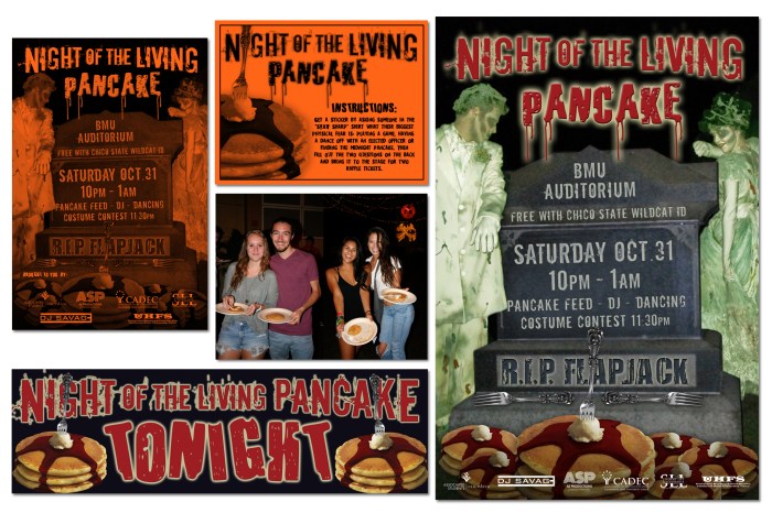
This event was designed to give the Chico State students an alternative activity to celebrate Halloween in a safe and fun environment on campus. To market this event I designed the following pieces: 1-color 1/2 page flyers (upper left corner), 1-color 1/4 page pancake stamp card (upper center), 11″ x 17″ and 20″ x 30″ 4-color posters (upper right corner), outdoor banner to be hung outside of the event (lower left corner), and various digital and web ads.
Associated Students Elections
For the Associated Students 2015 General Election campaign I received the request to create something with a retro look. I love advertising designs from the ’30s – ’50s, so I was quite excited to create this campaign. We had a limited budget to work with and 17,000 Chico State students to reach, so I wanted the look to be very eye-catching. I chose to use patriotic colors which would bring to mind voting and elections when seen by the viewer, but to keep with the retro feel of the past I used a darker red and blue and then a light cream instead of white to give more of an aged look. The first marketing target was to reach students who would want to run for office and the second target was to get as many students as possible to vote. I chose to have the “Run for Office” design be predominantly RED and the “Vote Online” design be predominantly BLUE. Both designs had the same look and feel, but I was able to differentiate the messages by color-coding them while assisting with keeping the production costs down for our minimal budget. For example, I decided to use 4″ x 6″ 2-sided postcards that featured “Run for Office” on one side and “Vote Online” on the other. This kept the budget down since we were not printing 2 separate postcards and we gained earlier “Vote Online” exposure. The result…we had more students vote in this election than any previous year and we received many compliments on the design. I even received requests for posters and postcards by people that wanted to hang them in their offices.
This campaign included the following pieces pictured below: 2-sided, 4/4 color postcards (upper left) which marketed “Run for Office” on one side and “Vote Online” on the other; 11″ x 17″ and 20″ x 30″ 4-color posters (upper center); 4-color self-standing vertical banners which were strategically placed in high student traffic areas throughout campus (right side); and a 3′ x 10′ full color vinyl banner which hung above the entrance to the student union. I also created a full color ad for the student newspaper and various web and digital ads that were used throughout campus on digital frames, as computer lab screen savers, as website homepage ads, and banner ads for social media sites.


Recycling Campaign
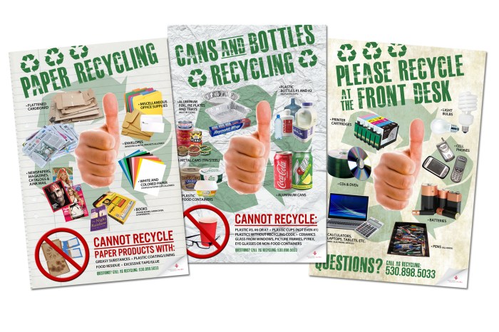
University Housing and Associated Students Recycling needed a strong, visually appealing campaign to educate the student residences about what can and cannot be recycled in the dorms and where they could dispose of these items. I came up with the following poster campaign which was used throughout all of the University Housing locations on the CSU, Chico campus.
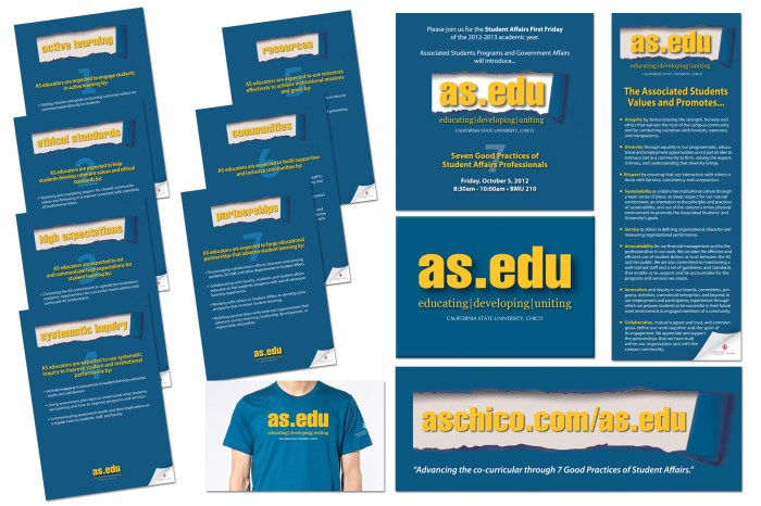
as.edu
The Programs and Government Affairs division of the Associated Students (AS) needed to present an educational campaign to the Student Affairs division of CSU, Chico regarding the seven values of the Associated Students. The concept of “as.edu” was developed and I needed to bring life to the concept by designing a “look” for as.edu while communicating the seven values and how the AS puts them into practice. This campaign included the following pieces (clockwise left to right): 20″ x 30″ 4-color posters introducing and defining the seven values; PowerPoint Presentation with slides for each of the values and examples of how they are put into practice; a 2-sided, 4/4 color bookmark of the values for each attendee; 4-color magnetic badges for each presenter and member of the as.edu team; and a T-shirt for each presenter. In addition to these items, I also created digital and website ads for as.edu which linked to the presentation from the Associated Students website.
Associated Students Choose Chico Campaign
Each spring California State University, Chico hosts a 1-day event for incoming freshman and transfer students called Choose Chico. On this day, the campus community rallies together to highlight all of the wonderful things CSU, Chico has to offer potential incoming students in the hope that the students will choose to attend Chico and commit to coming to CSU, Chico on this day. For the Associated Students, this day allows a venue for all of the 17+ programs, departments, and businesses to table, have activity booths, and showcase overall what the Associated Students has to offer from entertainment and outdoor activities to jobs and leadership opportunities for those want to be involved on campus and in the community. I was tasked with creating a unifying “look” for the Associated Students that would be consistent across all booths, tabling, and the various forms of outreach on this day. The result was a “Be…” theme to connect the students to the activity, program, or office of the Associated Students which included a call to action. I was also sure to include the corporate branding of the Associated Students which included the corporate colors and logo.
For this campaign I created the following pieces which were strategically placed in high-traffic areas and with tabling/booths that were used (clockwise left to right): full color, self-standing vertical banner; 8.5″ x 11″ table-top signs; 20″ x 30″ A-frame signs, a 3′ x 10′ banner which hung above the entrance to the student union; and red balloons that were custom imprinted with the Associated Students’ logo in white.

Wooden Nickel Program / Earth Month 2007
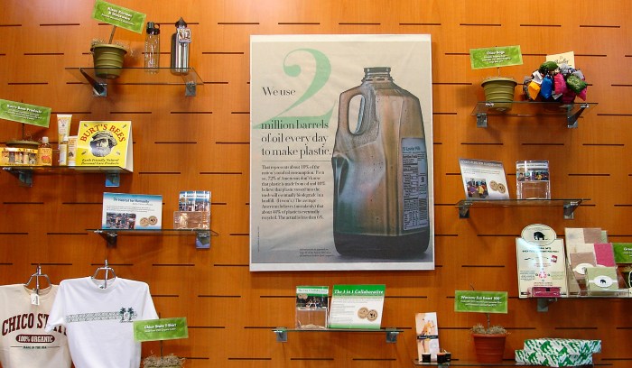
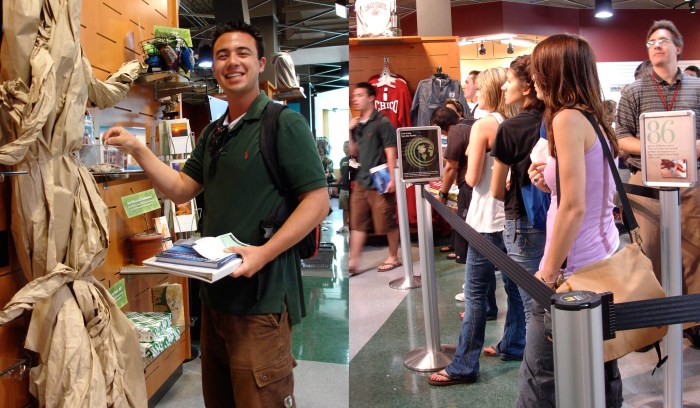
In 2007 the CSU, Chico campus and the Associated Students were focused on becoming a leader in sustainability among university campuses. As the Marketing and Promotions Coordinator for the Associated Students Bookstore (now called the Chico State Wildcat Store), I led and art directed a fabulous team of design and marketing students as we developed the “Wooden Nickel Program”. In order to educate the Chico State campus on sustainable practices, we developed this program which consisted of signage throughout the store to highlight our sustainable and earth-friendly merchandise. The signs would highlight why that product was considered to be sustainable (made from 100% organic cotton, locally made, made from recycled material, etc.) and when a customer purchased an item and kindly refused to take a plastic shopping bag, we would give them a wooden nickel. The customer could then choose one of three local, earth-friendly charities, in which to donate their nickel. At the end of the year, the store converted all of the collected wooden nickels into real nickels and donated the money to the designated charities. Although this concept is now widely used, it was a new concept at a time when plastic shopping bags were commonly used in large volume by retailers.
This campaign garnered quite a bit of positive attention among the college bookstore industry and I was asked to speak on this campaign at the California Association of College Stores’ annual conference. My creative team and I created the following pieces which were strategically placed next to the earth-friendly merchandise throughout the store, on end-caps in high-traffic areas, as part of a front window display focusing on sustainability with textbooks and as a center wall focal point display in the middle of the store where the customer could donate their nickels: custom imprinted wooden nickels, full-color signs to call-out the earth-friendly products, full color educational signs about each product, 8.5″ x 11″ point-of-purchase signs with earth-friendly facts to educate customers, digital ads, and various window and in-store displays.

